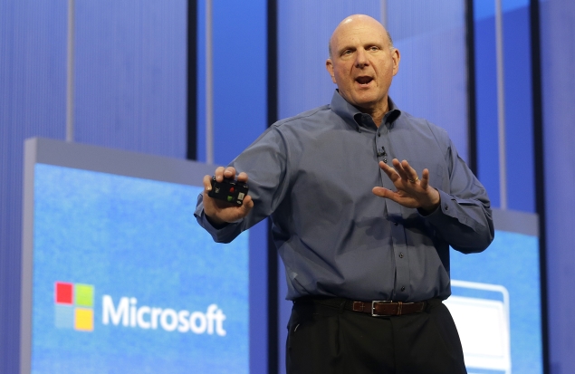
Microsoft CEO Steve Ballmer says the latest update to Windows is a "refined blend" of its older operating system for PCs and its new touch-enabled interface for more modern, mobile devices.
After some hands-on time with it, the update seems to me like a patch over an ever-widening chasm.
The issue is that there are over a billion personal computers that use some version of Windows as it existed until last October, when Microsoft unveiled Windows 8. All those PCs are responsive to mice and keyboards, not the touch screens and other input methods like voice and gestures that represent the future of computing. Making it easier to cross that bridge is one of the goals of Windows 8.1, a preview version of which Microsoft released Wednesday.
After spending several hours with devices running Windows 8.1, it remains unclear to me whether a touch-based environment is what traditional Windows users want to accomplish the productive tasks for which they've come to rely on Windows.
But Microsoft has added to 8.1 a grab bag of fun features that make the free update worthwhile.
One way Microsoft reaches into the past is by reviving the "Start" button in the operating system's traditional "Desktop" mode. It appears as a little Windows icon at the bottom left corner of the screen.
However, other than the location and its general look, the button doesn't do what it once did. A single tap brings you back to the "Modern" interface, instead of the traditional Start menu, which used to bring up a whole host of convenient items like recent programs and commonly used folders.An extended press brings up a list of complex settings functions - the kind that most people would probably rather leave to their tech department if they are fortunate enough to have one.
So, instead of bringing back a familiar environment, the revived "Start" button is mainly just another way of directing you to the new one.
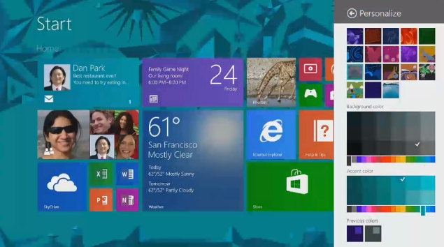 Another way Microsoft attempts to appease its established PC user base is by allowing people to launch their computers directly into the "Desktop" environment. But again, with no way to access programs except through the "Modern" interface, there is little cause for celebration among traditionalists.
The main changes in Windows 8.1 offer an easier way to function inside its "Modern" environment, better more integrated search results, and a hint of what's possible in the future.
One feature that makes the new environment easier to navigate: Now, a screen called "All Apps" is just a swipe away from the "Modern" tile screen. Swiping up literally displays all the apps on the computer, not just the ones that you have made as favorites on the start screen. In the past, you had to swipe up from the bottom edge and tap another button to get there.
Unfortunately, the "All Apps" page feels like too much. An array of icons easily covers two full screens. Although you can re-organize the apps into categories or alphabetically, there are too many to make it easy to use.
It's easier to use the search function, which can either be brought up by swiping in from the right edge, or just typing when in the "Modern" tile screen.
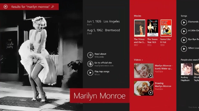
Entertainers get terrific new billing in Microsoft's improved search function. Type in an artist's name, say Lily Allen, and Windows 8.1 brings up a lively and colorful sideways-scrollable page that shows big photos, her birth date, and a list of songs and videos followed by decent-sized renditions of websites.
Clicking on a play button alongside a song instantly plays it. You don't have to own the song, because Microsoft throws in the feature as part of its Xbox Music service - which inserts ads unless you pay a monthly fee. You can queue up all the top songs and even add them to a playlist for listening to later.
 Windows 8.1 can also run on smaller devices, including Acer's Iconia W3, which has an 8.1-inch screen measured diagonally and works with a wireless keyboard that also acts as a stand. In the past, screens had to be about 10 inches or longer diagonally.
Some add-ins didn't really excite me. The ability to resize the split-screen, which lets you do more than one thing at once, lacked pizazz. On the Acer and even Microsoft's own Surface Pro, you can only split the screen in two, and only at fixed intervals. With the update, the screens can be half-and-half or roughly cover one-third or two-thirds of the screen, instead of one taking up a sliver as in Windows 8.
Another feature is a predictive text function. Windows 8.1 offers up three predictions for words you are typing on an onscreen keyboard when in certain apps like Mail. To me, the feature seemed to be more annoying than useful, even though you can select the options with sideways swipes on the space bar.
Yet another feature turned the camera into a motion detector. In one demo, Microsoft's new "Food and Drink" app lets users swipe through a recipe with mid-air hand gestures. In practice, this often failed, sometimes turning pages in the wrong direction or not reacting at all. Still, it's a way to struggle through a recipe if your hands are coated with sauce.
At Wednesday's presentation, Microsoft executives previewed future Windows functions that could come in handy, including voice recognition in apps and contextual understanding of spoken questions.
For example, corporate vice president Gurdeep Singh Pall demonstrated a prototype travel planning app that not only showed 3-D overhead views of cities but gave computer-voice tours of various monuments. Speaking the question "Who is the architect?" brought up a webpage showing the answer, simply because the building that the architect designed was in view in the maps app.
 "Apps are going to have eyes, they're going to have ears, they're going to have a mouth," said Pall.
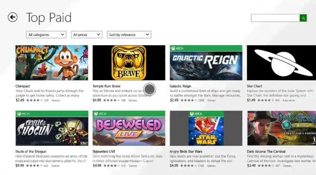
As of this month, Microsoft says its new Windows platform will have 100,000 apps, and the company made it clear it hopes developers make even more, incorporating some of the new tools it has made available to them.
Ballmer said in his keynote he hopes that Windows 8.1 also offers a "great path forward" for users of the millions of programs that work on older versions of Windows. By showing off a variety of enticing features of the new interface, however, it's clear that path leads through the "Modern" world.
After some hands-on time with it, the update seems to me like a patch over an ever-widening chasm.
The issue is that there are over a billion personal computers that use some version of Windows as it existed until last October, when Microsoft unveiled Windows 8. All those PCs are responsive to mice and keyboards, not the touch screens and other input methods like voice and gestures that represent the future of computing. Making it easier to cross that bridge is one of the goals of Windows 8.1, a preview version of which Microsoft released Wednesday.
After spending several hours with devices running Windows 8.1, it remains unclear to me whether a touch-based environment is what traditional Windows users want to accomplish the productive tasks for which they've come to rely on Windows.
But Microsoft has added to 8.1 a grab bag of fun features that make the free update worthwhile.
One way Microsoft reaches into the past is by reviving the "Start" button in the operating system's traditional "Desktop" mode. It appears as a little Windows icon at the bottom left corner of the screen.
However, other than the location and its general look, the button doesn't do what it once did. A single tap brings you back to the "Modern" interface, instead of the traditional Start menu, which used to bring up a whole host of convenient items like recent programs and commonly used folders.An extended press brings up a list of complex settings functions - the kind that most people would probably rather leave to their tech department if they are fortunate enough to have one.
So, instead of bringing back a familiar environment, the revived "Start" button is mainly just another way of directing you to the new one.
 Another way Microsoft attempts to appease its established PC user base is by allowing people to launch their computers directly into the "Desktop" environment. But again, with no way to access programs except through the "Modern" interface, there is little cause for celebration among traditionalists.
The main changes in Windows 8.1 offer an easier way to function inside its "Modern" environment, better more integrated search results, and a hint of what's possible in the future.
One feature that makes the new environment easier to navigate: Now, a screen called "All Apps" is just a swipe away from the "Modern" tile screen. Swiping up literally displays all the apps on the computer, not just the ones that you have made as favorites on the start screen. In the past, you had to swipe up from the bottom edge and tap another button to get there.
Unfortunately, the "All Apps" page feels like too much. An array of icons easily covers two full screens. Although you can re-organize the apps into categories or alphabetically, there are too many to make it easy to use.
It's easier to use the search function, which can either be brought up by swiping in from the right edge, or just typing when in the "Modern" tile screen.
Entertainers get terrific new billing in Microsoft's improved search function. Type in an artist's name, say Lily Allen, and Windows 8.1 brings up a lively and colorful sideways-scrollable page that shows big photos, her birth date, and a list of songs and videos followed by decent-sized renditions of websites.
Clicking on a play button alongside a song instantly plays it. You don't have to own the song, because Microsoft throws in the feature as part of its Xbox Music service - which inserts ads unless you pay a monthly fee. You can queue up all the top songs and even add them to a playlist for listening to later.
 Windows 8.1 can also run on smaller devices, including Acer's Iconia W3, which has an 8.1-inch screen measured diagonally and works with a wireless keyboard that also acts as a stand. In the past, screens had to be about 10 inches or longer diagonally.
Some add-ins didn't really excite me. The ability to resize the split-screen, which lets you do more than one thing at once, lacked pizazz. On the Acer and even Microsoft's own Surface Pro, you can only split the screen in two, and only at fixed intervals. With the update, the screens can be half-and-half or roughly cover one-third or two-thirds of the screen, instead of one taking up a sliver as in Windows 8.
Another feature is a predictive text function. Windows 8.1 offers up three predictions for words you are typing on an onscreen keyboard when in certain apps like Mail. To me, the feature seemed to be more annoying than useful, even though you can select the options with sideways swipes on the space bar.
Yet another feature turned the camera into a motion detector. In one demo, Microsoft's new "Food and Drink" app lets users swipe through a recipe with mid-air hand gestures. In practice, this often failed, sometimes turning pages in the wrong direction or not reacting at all. Still, it's a way to struggle through a recipe if your hands are coated with sauce.
At Wednesday's presentation, Microsoft executives previewed future Windows functions that could come in handy, including voice recognition in apps and contextual understanding of spoken questions.
For example, corporate vice president Gurdeep Singh Pall demonstrated a prototype travel planning app that not only showed 3-D overhead views of cities but gave computer-voice tours of various monuments. Speaking the question "Who is the architect?" brought up a webpage showing the answer, simply because the building that the architect designed was in view in the maps app.
 "Apps are going to have eyes, they're going to have ears, they're going to have a mouth," said Pall.
As of this month, Microsoft says its new Windows platform will have 100,000 apps, and the company made it clear it hopes developers make even more, incorporating some of the new tools it has made available to them.
Ballmer said in his keynote he hopes that Windows 8.1 also offers a "great path forward" for users of the millions of programs that work on older versions of Windows. By showing off a variety of enticing features of the new interface, however, it's clear that path leads through the "Modern" world.

0 comments:
Post a Comment